After the introduction of my network statistics data collection system in the previous post I can now analyze my line usage over time in detail. Here’s a screenshot that shows a number of overlapping data flows.
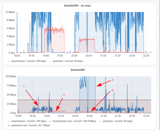
The screenshot contains two Grafana charts that show the data traffic of my DSL line over the course of 4 hours. The x-axis of top graph is caped at 10 Mbit/s while the lower graph shows the same time frame but with the full line rate of 100 Mbit/s in the downlink direction on the x-axis. A red line is drawn at 38 Mbit/s and shows the maximum uplink speed of the connection.
The first arrow I drew in the screenshot points to a video streaming data flow. On average, 12-15 Mbit/s is used which is quite a lot. Most video streaming services require a lot less.
The second arrow points to a data stream that occurred in the uplink direction for around 45 minutes that had a constant data rate of around 6 Mbit/s. I am not sure what was transferred here but it was probably not a 2-way video call as there was little to no data transferred in the downlink direction at the same time. So perhaps somebody downloaded something from my file server and was limited at their end to 6 Mbit/s.
Arrow 3 points to a massive incoming data stream that took around 20 minutes. Actually, there seem to be two downloads with a little break in between. The first download almost used the full DSL line bandwidth while the second one fully utilized the line. Arrow 4 points to the TCP ACK data stream required by the massive download, around 3.5 Mbit/s! Also noteworthy: The download overlapped the 15 Mbit/s video streaming session that was going on at the same time!
And one more point I interpret into the graph: 8 pm in the evening is one of the busiest hours for home connectivity. Nevertheless I was able to make full use of my DSL line which means there was enough capacity in the ISPs transport network, peerings and interconnects to accommodate me during busy hour.
