In the first part of episode 3 on this topic, I have shown how throughput looks like in a good LTE network in which more than one user was activate at a time. I can’t be sure, but based on typical cellular scenarios, there were probably more than 30 concurrent active users in the cell. So I wondered how the throughput graph would look like in a 5 GHz Wi-Fi network with many users. A place with heavy Wi-Fi use are universities, so I decided to run a few throughput tests in an Eduroam Wi-Fi network. And here’s how the throughput of an iperf3 download from one of my servers to my notebook looked like:
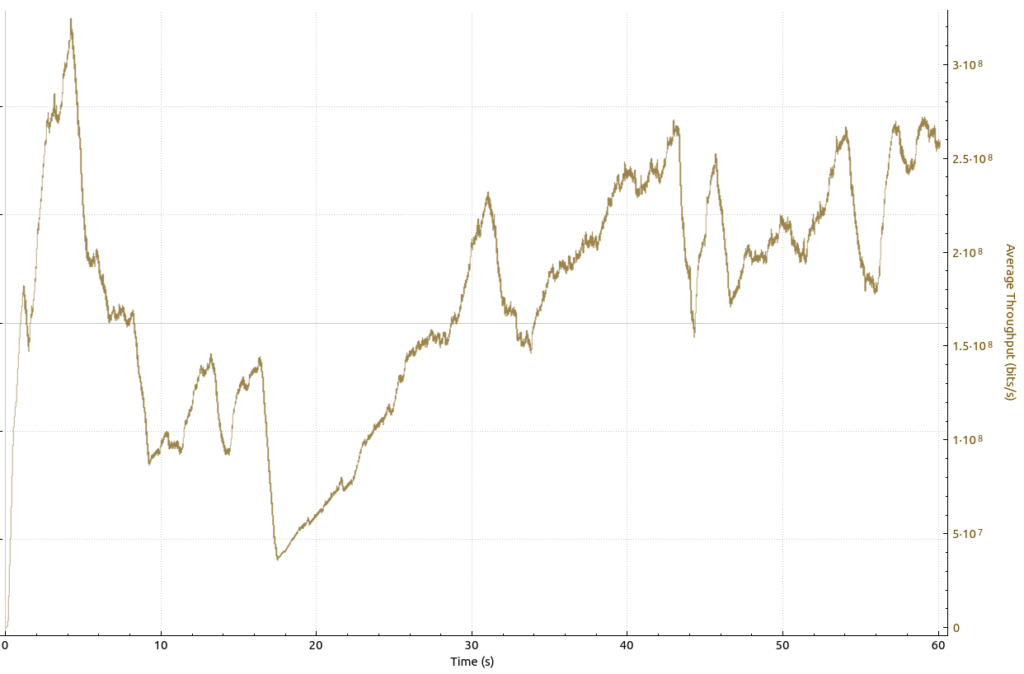
I took this throughput graph on a 5 GHz Wi-Fi channel on which the beacon frames announced that more than 50 devices were currently associated. As you can see, the throughput varied mostly between 150 and 300 Mbit/s, with a (single) short downwards dip to 50 Mbit/s. Overall, I’d say this is stellar performance in a relatively busy environment. Also, if you compare basic shapes and behavior of the transmission, this looks strikingly similar to the LTE throughput graph in the previous blog post on the topic.
But there is more…
Now let’s have a look at the throughput graph for an uplink data transmission. Unlike cellular networks, there is no central scheduler on the network side in Wi-Fi networks. Instead, a decentralized scheduling method is used, so downlink and uplink transmissions should actually look pretty much identical. But this was not the case here:
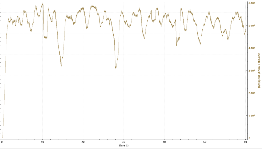
While general behavior of the speed increases and decreases look very similar compared to the downlink graph above, throughput in the uplink direction on the same Wi-Fi channel at the same location was much higher. The average is well above 500 Mbit/s. Also, the downward drops are not as steep as in the downlink direction. In other words: The much slower speeds in the downlink direction were not caused by the capacity of the wireless channel. Rather, it is much more likely that the lower downlink throughput is due to the much higher load of the backhaul link in the downlink direction. That’s typical, as in most networks, devices and their users consume much more data than they produce.
And here’s a part of the TCP sequence graph that belongs to the throughput graph above that reveals an interesting problem:
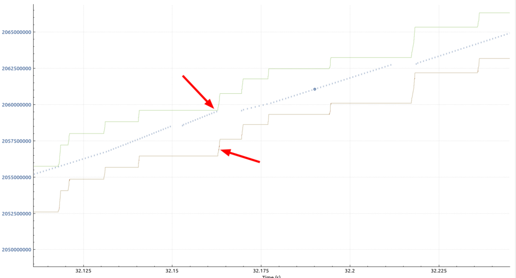
The top arrow in this part of the sequence graph points at a location when the green and blue lines meet. Here, the number of bytes in flight (blue line) hit the green line that shows the maximum TCP window size. As a consequence, my notebook had to stop its uplink transmission to protect the TCP buffer on the other side from overflowing. In other words, throughput could have been higher if the TCP window size on the receiver size had been bigger. The lower arrow points to two red dots which are marked as “window full” in Wireshark:
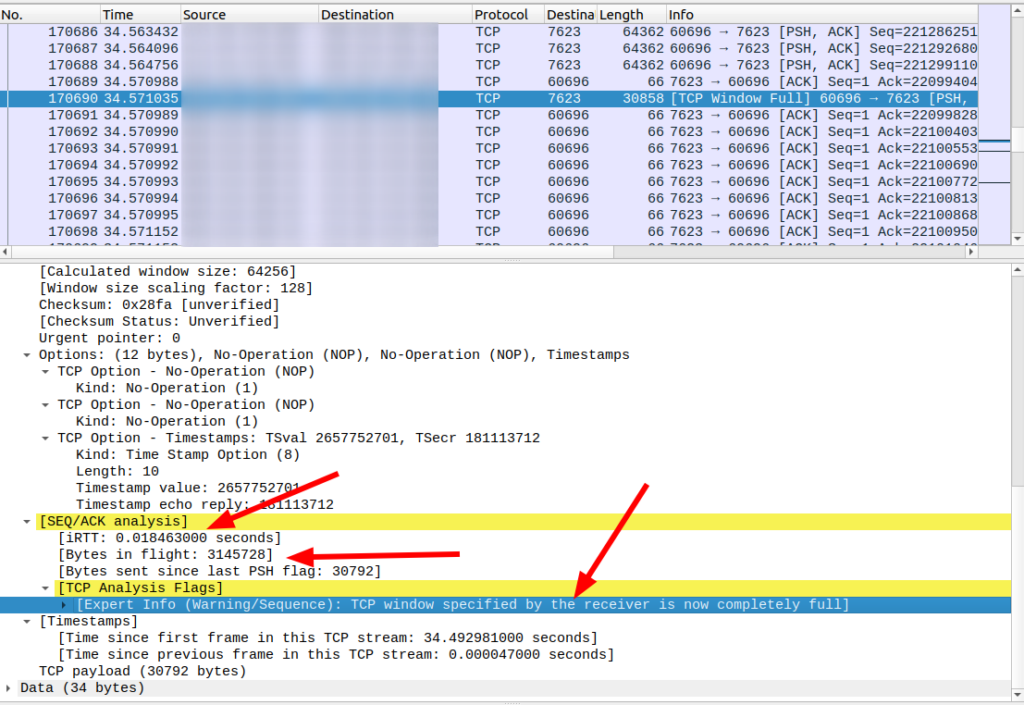
Let’s have a closer look at the window size on the receiver side. When looking into the pcap trace, I could see that the window size on the receiver size increases up to a value of around 3 megabytes. The initial round trip time (iRTT) from my notebook to the server was around 18 ms*. However, at full throughput, the resulting round trip timer gets much higher, around 30 ms, but there are many instances of 50 ms or more as well:
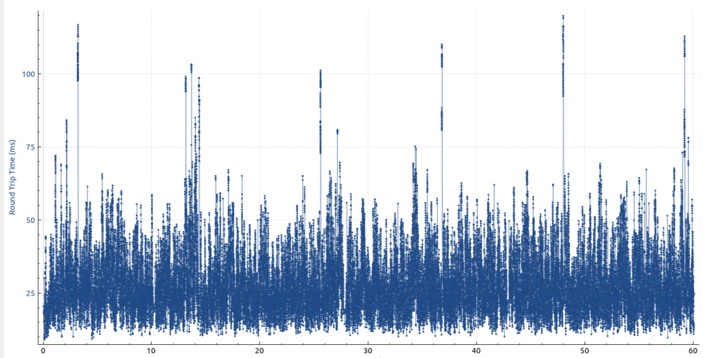
So with a 500 Mbps (62,5 MB/s) throughput and a round trip time of 50 ms, the number of bytes in flight is around 3 MB, i.e. that’s the receiver’s TCP window size. Any round trip delay that is higher than 50 ms will quickly lead to a stall.
This is confirmed by the following graph which shows how much of the TCP window was used for bytes in flight:
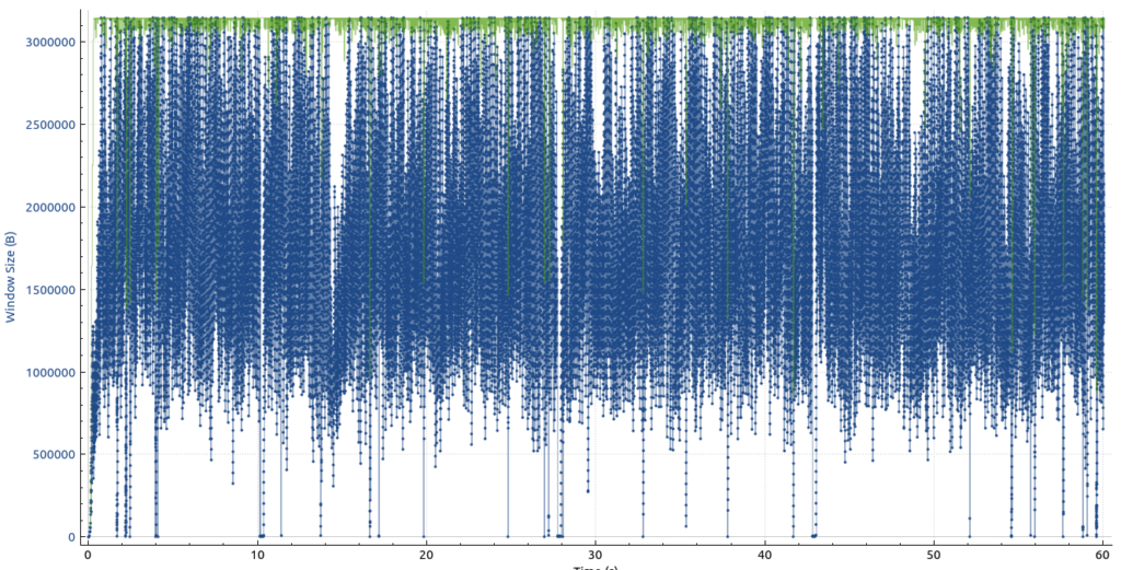
The green dots show the maximum TCP receive window size and the blue line shows how close the sender came to it over time. The graph shows quite clearly that the maximum window size was frequently hit.
So as cool as the 500 Mbps throughput looks, more would perhaps have been possible if there weren’t frequent occurrences of the bytes in flight hitting the TCP receive window size. Which begs the question of how these graphs look like between two servers in data centers with a similar latency, i.e. without a Wi-Fi in between. To be continued…
* Be careful with the iRTT Wireshark shows in all packets of a TCP connection. This is the INITIAL round trip time when there was no load on the network interface from the data transmission test. During the test, the round trip time can be very different and is best visualized as shown above!